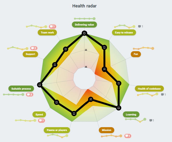
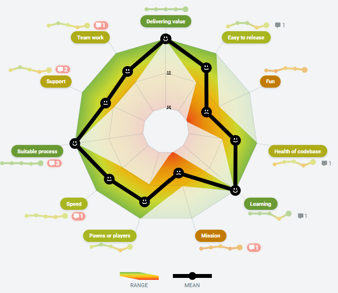
Health check radar statistics
Heath Check Radar statistics give you more insight into how your team responded during a health check. This makes it easier to identify trends, patterns, or anomalies that you can address as a group.
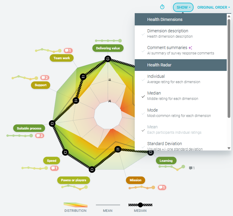
For each health dimension, you can view the following statistics:
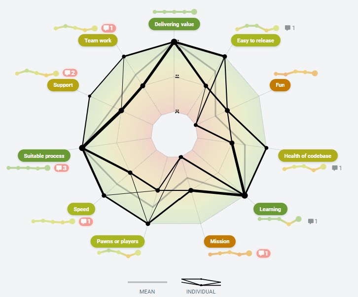
- INDIVIDUAL - each person’s ratings visualized on their radar line
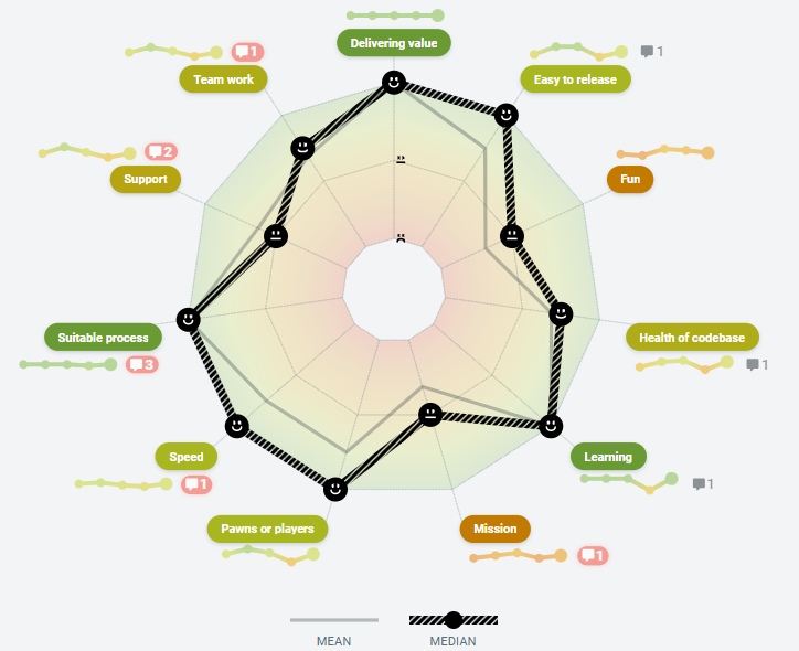
- MEDIAN- the middle rating when values are sorted
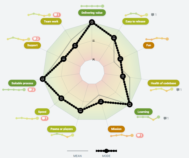
- MODE - shows the most frequently selected rating
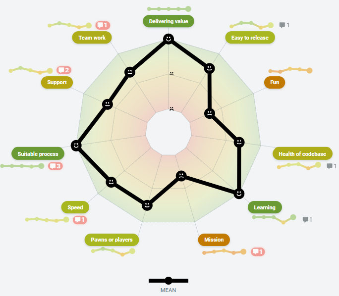
- MEAN - shows the average of all ratings
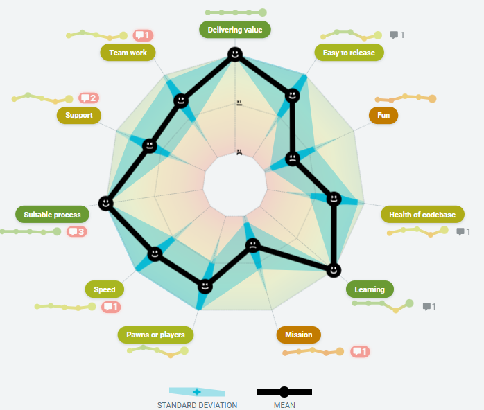
- STANDARD DEVIATION - shows a spread of 1 standard deviation of responses
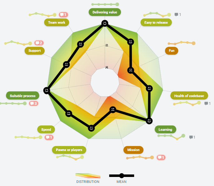
- DISTRIBUTION- heat map of where responses cluster
- RANGE - the spread from the highest to the lowest ratings
By default, the mean is always shown and cannot be deselected. Any additional statistics you choose will be overlaid on top of the mean.
How to use radar statistics
- After each team member has rated, go to the DISCUSS step.
-
Use the SHOW dropdown menu to select the statistics you would like to display. You can choose one or more statistics to view. The Mean is the default.

- The selected statistics will appear on everyone’s screen, making it easier to lead a focused conversation.
What each statistic tells you
-
INDIVIDUAL visualizes each person's response as their spider graph. The more solid the line, the more consensus there is on that dimension.

-
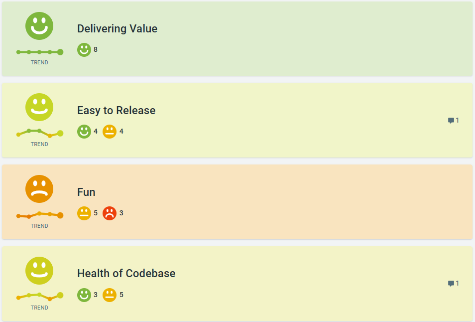
MEDIAN shows the middle rating from the group. The further away the median is from the mean, the greater the disparity is in the responses for that dimension.
-
MODE shows the most common rating by team members for a dimension and shows the majority rating. i.e the most commonly voted rating for Process is 2.
-
MEAN is the default rating and shows the sum average of all responses. This is the baseline statistical measure.
-
STANDARD DEVIATION visualises a band across the responses showing 1 standard deviation.
-
DISTRIBUTION visualizes all responses as a heat map, showing you where most people responded on a particular rating, per dimension.. The darker colours indicate a higher number of responses, and the more opaque ones indicate a lower number.
-
RANGE shows the spread from the highest to the lowest responses for each dimension. This lets you see how widely spread views may be within your team, or if they are, in fact, close to a consensus.


-
Each health dimension card continues to show the mean (average) results. If you have run the same health check before, the average rating of each dimension will be shown as a trend line. There is also a tally of individual responses from the current health check.

-
When you SHARE the final health check report, any selected statistics will also be displayed on the summary report.